







How to plan an in-store print campaign that gets noticed

An in-store print campaign succeeds when it earns attention in the few seconds customers spend scanning a space. Window graphics, shelf talkers, hanging signs, counter cards and point-of-sale displays turn a retail environment into a sequence of brand encounters. When these materials share a clear purpose and a consistent visual language, they support customer attention, trust and brand recall at the moment a purchase decision is forming.
Start with a campaign objective that can guide every format
Before selecting a poster size or display material, define the action you want customers to take. A campaign designed to launch a new product needs visibility from a distance. A campaign promoting a limited offer needs speed and a clear deadline. A campaign that explains a premium product may need more detailed printed materials near the shelf or consultation area.
Set one primary objective, then identify supporting measures. For example, a cosmetics retailer may want to increase trials of a new serum. The window display can generate initial interest, a floor decal can guide visitors towards the relevant aisle, and a shelf-mounted card can provide benefits, price and a simple call to action.
The physical setting changes the decision. Consider:
- The distance from which the message must be read.
- The amount of time customers spend in each area.
- The direction of customer traffic.
- Lighting conditions and available display surfaces.
- Existing signage that may compete for attention.
A printed message becomes memorable when the right idea appears in the right place at the right moment.
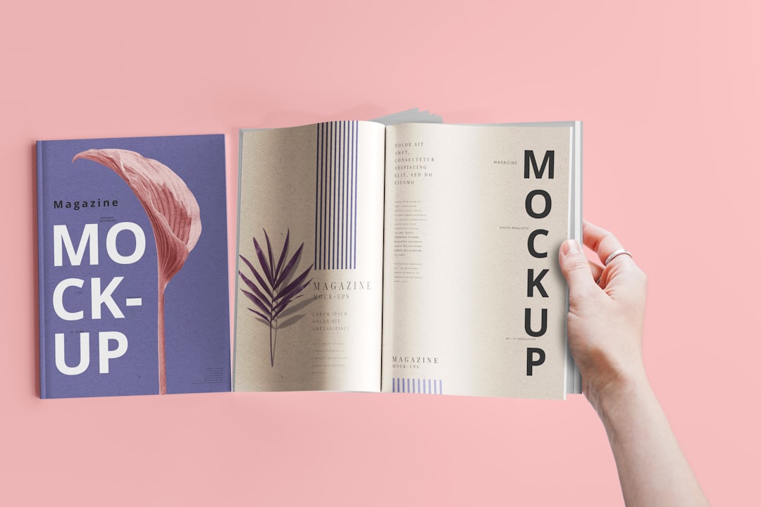
A single campaign may include large-format posters, rigid display boards, vinyl window graphics, wobblers, leaflets and countertop units. Each has a different role. Using every format without a hierarchy, however, can create visual noise rather than impact.
Choose printed visual communication for the retail environment
Print choices should match both the campaign objective and the store’s operational realities. Large-format retail signage can use foam board, PVC, cardboard, fabric, paper posters or adhesive vinyl, depending on durability, viewing distance, installation method and expected campaign duration. A short seasonal promotion may work with recyclable cardboard displays, while a long-running navigation system may require robust rigid panels or laminated graphics.
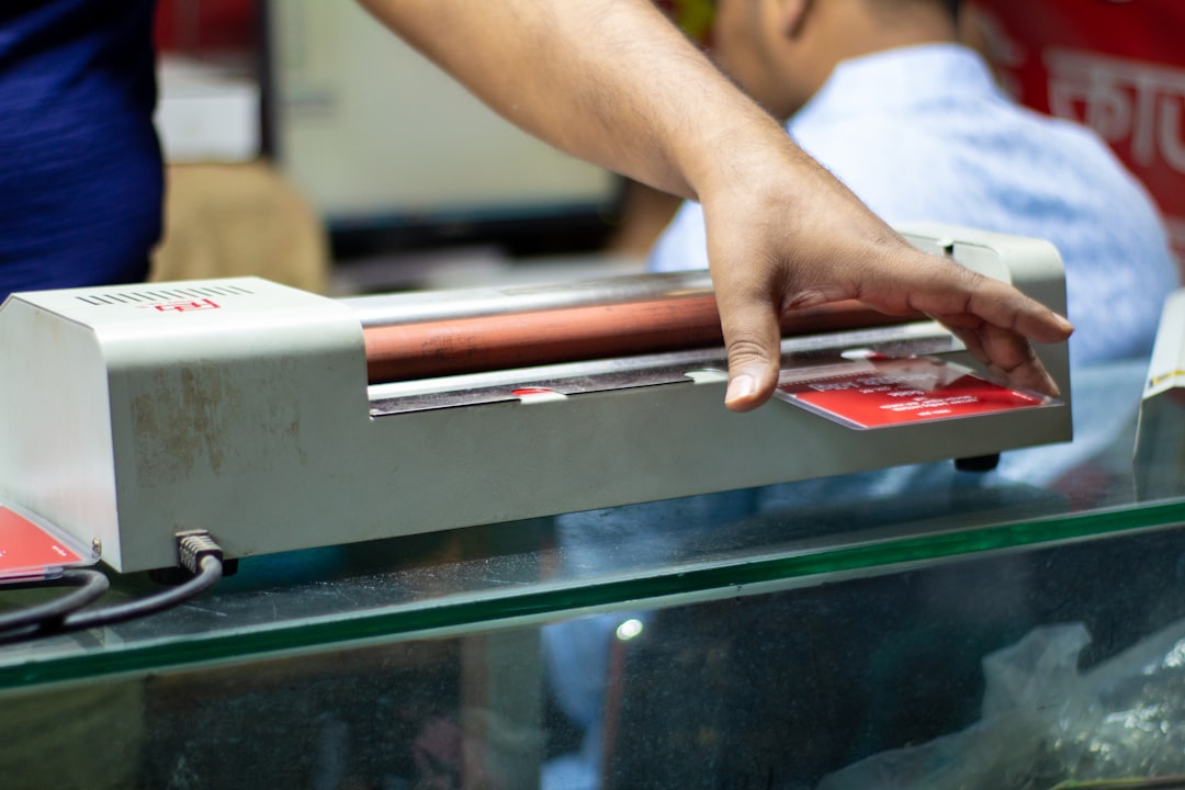
When comparing substrates, finishes, point-of-sale displays and installation options, learn more about print and visual communication solutions suited to physical commercial spaces. Consider whether a display will be freestanding, wall-mounted, suspended or applied to glass, as each placement affects material selection and finishing. Lamination can protect high-contact graphics, while die-cutting, folding and custom structures can turn a standard printed panel into a more engaging retail display.
Match the format to the customer’s viewing distance
A message seen from across a shop should not carry the same amount of information as a shelf label. Use a layered approach:
- Far-distance communication captures attention with a product image, campaign name or short offer.
- Mid-distance signage explains the category, benefit or route to a promotional area.
- Close-range print provides details, comparisons, QR codes, ingredients, pricing or instructions.
This hierarchy prevents a common error: placing dense copy on a poster that customers only see in passing. A shopper walking through an entrance needs a simple visual cue. A customer standing beside a product can engage with more specific information.
Build a coherent journey through signs and printed touchpoints
Visual merchandising works best when printed materials act as connected touchpoints rather than isolated assets. Map the customer journey from the exterior of the store to the checkout. Mark the moments where a printed message can introduce, reinforce or complete the campaign.
The entrance can carry the central campaign promise. A directional sign can guide visitors to the relevant department. A freestanding display can create a product focal point. Shelf strips and product cards can answer practical questions. At checkout, a smaller printed message can prompt an additional purchase or invite customers to join a loyalty programme.
Keep the visual system stable across these placements. Use the same campaign colour palette, typefaces, logo treatment, photography style and tone of voice. Consistency does not mean repetition. The core message can remain stable while the format adapts to the customer’s position and level of interest.
Allow adequate negative space around the main message. Retail spaces are busy, with packaging, lighting, fixtures and other brands competing for attention. A simple high-contrast composition usually performs better than an overloaded layout.
Prepare artwork that prints accurately and remains readable
A compelling concept can lose force when the production file is poorly prepared. Build print-ready artwork from the beginning rather than treating technical checks as a final administrative step. Confirm the printer’s specifications for dimensions, bleed, safe margins, resolution, colour profile and file format.
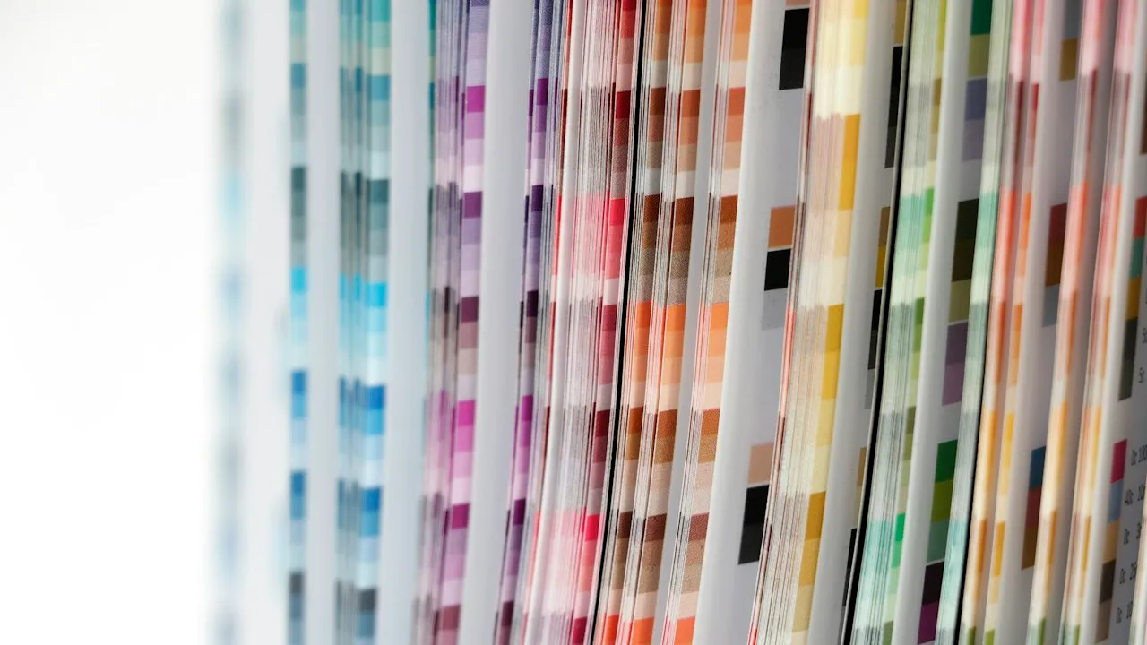
For most commercial printing, artwork should use CMYK colours rather than RGB values intended for screens. RGB blues, greens and fluorescent tones can shift noticeably in print, especially when a design relies on vivid brand colours. Ask for a colour proof when the campaign includes packaging, brand-defining shades or materials printed across multiple suppliers.
Colour consistency in printing also depends on substrate and finish. The same ink values can appear different on uncoated paper, glossy stock, textured board or translucent vinyl. A matte finish may support readability under strong store lighting, while gloss can increase visual intensity but introduce reflections.
Check these details before production:
- Use high-resolution images at the final output size.
- Convert or package fonts according to the printer’s requirements.
- Add bleed and keep essential copy away from trim edges.
- Verify contrast for small text and QR codes.
- Review spelling, pricing, legal wording and promotion dates.
- Request a physical proof for high-volume or colour-sensitive campaigns.
Make your in-store print campaign easier to remember
The strongest campaigns connect strategic planning with production discipline. Begin with a measurable retail objective, design the customer journey, assign each printed format a specific function and test artwork under real viewing conditions. The final result should feel native to the store, not added as an afterthought.
Key points to retain include:
- Define the desired customer action before choosing posters, displays or signage.
- Plan messages by viewing distance, from storefront impact to shelf-level detail.
- Select materials according to placement, durability, lighting and installation needs.
- Maintain a unified visual system across every printed touchpoint.
- Prepare CMYK-aware, print-ready artwork and validate colour through proofs when needed.
- Use clear hierarchy and readable layouts to cut through retail clutter.