

How to choose paper stock for brochures
A brochure’s paper stock influences far more than its appearance. It affects how the piece feels in a reader’s hands, how colours reproduce, whether text remains easy to read, and how confidently your brand is perceived. The right choice balances your campaign goals, budget, design, distribution method, and the practical demands of the finished brochure.
Start with the brochure’s purpose and reader journey
Before comparing weights and finishes, define what the brochure must achieve. A short promotional handout for a retail counter has different needs from a premium product catalogue, a property prospectus, or an information pack sent by post.
Think about where readers will encounter it. A brochure handed out at an event needs to withstand frequent handling. A menu, price list, or healthcare leaflet may need a writable surface and exceptionally clear text. A high-end brand brochure may benefit from a tactile, uncoated sheet that encourages readers to slow down.
Your print campaign also needs to fit the wider customer experience. If you are preparing materials for shops, exhibitions, or local promotions, How to plan an in-store print campaign that gets noticed can help you align format, placement, and messaging before selecting stock.
Ask a few practical questions:
- Will readers keep the brochure or dispose of it quickly?
- Is it likely to be carried in a bag, posted, or displayed on a counter?
- Does the design use photography, detailed product images, or mostly text?
- Will people need to write notes, complete a form, or add contact details?
- Does the brochure need to feel economical, premium, natural, technical, or luxurious?
Paper should reinforce the intended action, whether that is booking a consultation, comparing products, visiting a store, or remembering your brand.
Match paper weight to handling and page count
Paper weight is normally measured in grams per square metre, or gsm. Higher gsm generally means a thicker, sturdier sheet, though thickness also varies by paper type and manufacturer.
For many brochures, a lighter stock works well for inside pages, while a heavier stock gives the cover greater durability. A common approach is to use 115 gsm to 170 gsm for internal pages and 250 gsm to 350 gsm for covers. The appropriate combination depends on the page count, folding style, and how substantial you want the item to feel.
A single-fold or tri-fold leaflet often needs enough weight to avoid looking flimsy, but not so much that folds crack or spring open. Multi-page brochures can use lighter interior sheets to control postage and production costs. For a short premium booklet, matching cover and text weight may create a more cohesive object.
Consider the following general guide:
- 90 gsm to 115 gsm: suitable for economical inserts, mailers, and text-heavy information sheets.
- 130 gsm to 170 gsm: a versatile range for brochure pages, promotional leaflets, and product guides.
- 200 gsm to 250 gsm: useful for robust flyers, compact brochures, and lighter covers.
- 300 gsm to 350 gsm: suited to premium covers, postcards, and materials that need noticeable rigidity.
Weight also contributes to consistent brand perception. If your digital communications are polished and premium, a thin, low-cost leaflet can create an unwanted disconnect. Consider the principles in Brand consistency across print and digital channels when matching physical materials to your website, email campaigns, and social content.
Choose a finish that suits your imagery and message
Paper finish changes both the visual result and the reading experience. The most common choices are gloss, silk or matt coated, and uncoated paper.
Gloss-coated paper has a shiny surface that can make photographs and bold colours appear vibrant. It is often effective for travel, food, fashion, automotive, and product-focused brochures. However, reflected light can make lengthy text harder to read, and gloss is not always comfortable for writing.
Silk or matt-coated stock offers a smoother, more restrained appearance. It retains good colour reproduction while reducing glare, making it a dependable option for corporate brochures, service guides, and catalogues. A matt finish can feel refined, particularly with clean layouts and minimal colour palettes.
Uncoated paper has a natural, tactile surface. It works well for brands that want an approachable, sustainable, artisanal, or editorial character. Text is highly readable on uncoated sheets, and the surface is usually easy to write on. Colours may appear softer than on coated paper, so request a proof if exact colour reproduction matters.
For sensitive sectors, paper choices must support clarity and appropriate communication. A patient-facing leaflet, for example, benefits from readable type, controlled glare, and an unobtrusive finish. The guidance in Ethical healthcare conference marketing: a practical compliance framework is useful when printed materials must meet both brand and professional expectations.
Test opacity, colour and finishing details before ordering
A paper stock can look excellent as a sample yet behave differently once your design is printed on both sides. Opacity refers to how much show-through occurs from the reverse side. This matters for brochures with dark backgrounds, dense photography, or large areas of colour. A more opaque stock helps prevent images and text from distracting readers through the sheet.
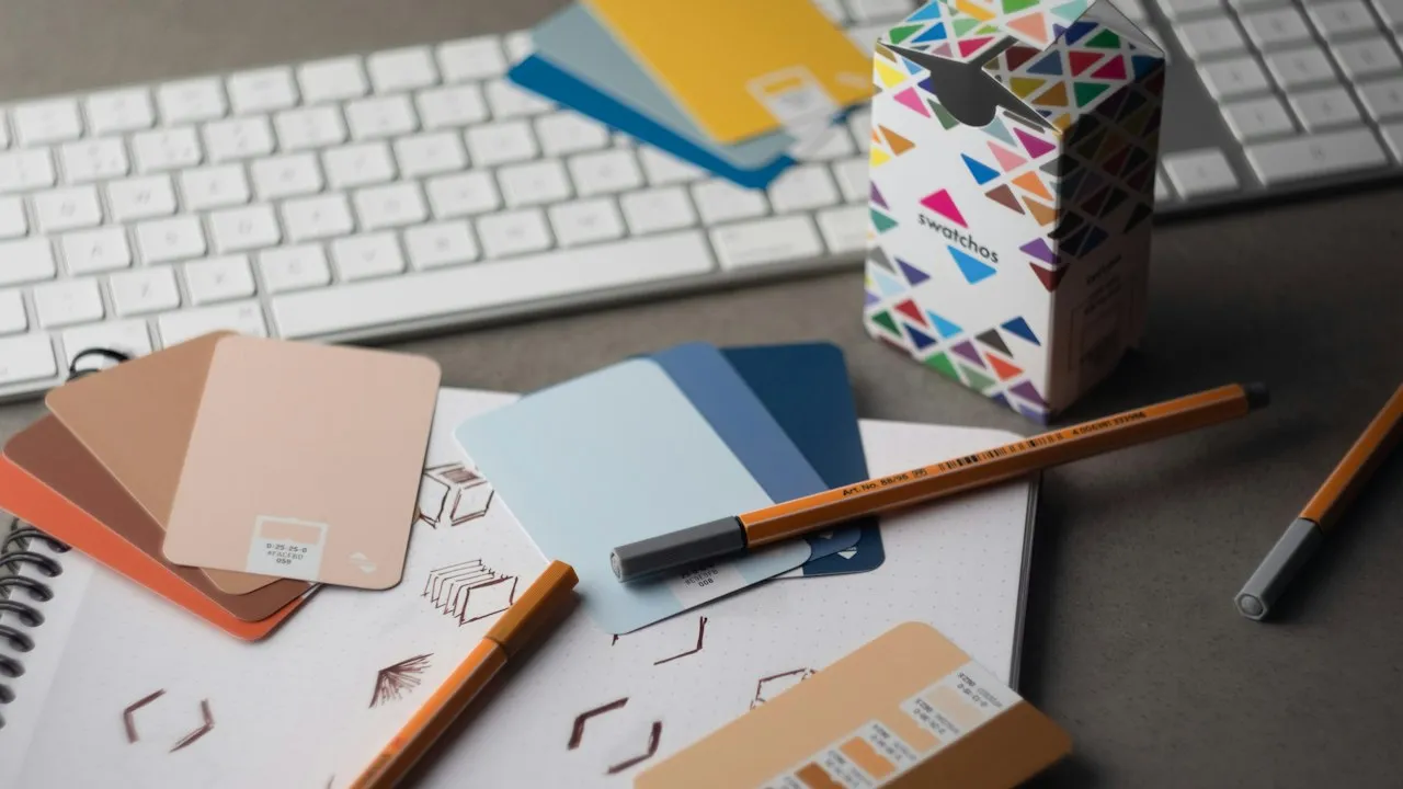
Request a printed proof or, at minimum, a sample pack containing the stocks under consideration. Review it in the lighting conditions where readers are likely to see it, such as daylight, office lighting, or retail spotlights. Check whether small text remains sharp, skin tones look natural, and brand colours retain their intended character.
Finishing choices can further influence the final result. Lamination adds protection and can provide a gloss, matt, or soft-touch surface. Spot UV can highlight a logo or image, while embossing and foil can add texture or shine. Use these treatments selectively. Excessive finishing may raise costs and distract from the message.
Trust also depends on materials feeling considered and consistent, particularly if your organisation has experienced public scrutiny. Rebuilding brand trust after a reputation crisis offers useful perspective on ensuring every customer touchpoint communicates care and reliability.
Make a paper choice that supports your marketing goals
The best brochure stock is not automatically the heaviest, glossiest, or most expensive option. It is the one that makes your message easy to absorb while giving readers a physical experience that fits your brand and campaign.
Keep these decisions in view before approving print:
- Define the brochure’s purpose, audience, and distribution method first.
- Select gsm according to page count, fold type, handling, and postage needs.
- Use gloss for high-impact imagery, matt or silk for balance, and uncoated stock for texture and readability.
- Check opacity when printing double-sided designs with strong colours or imagery.
- Order samples and proofs before committing to a large print run.
- Treat paper, finish, and binding as part of your brand message, not merely production specifications.
A carefully chosen paper stock can make your brochure more enjoyable to hold, easier to read, and more memorable long after the first interaction.