







Designing social media graphics that get noticed
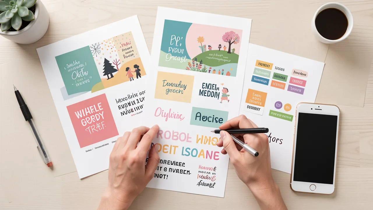
Social media graphics compete for attention in a fast-moving feed. A strong visual must communicate its message quickly, reflect your brand accurately, and encourage a specific response. Whether you are promoting a service, announcing an event, or sharing useful advice, thoughtful design helps your content earn a pause rather than disappear in the scroll.
Effective social media graphics begin with a clear job
Before opening a design tool, decide what each graphic needs to achieve. A post with several competing messages often feels cluttered and gives the viewer no reason to act. Focus on one primary purpose: build awareness, generate clicks, promote a product, collect registrations, or encourage comments.
Write a short creative brief containing the audience, platform, message, call to action, and deadline. This gives you a practical filter for every design choice. If a headline, image, or decorative element does not support the post’s purpose, remove it.
A product launch graphic, for example, may need a product image, a concise benefit, a release date, and a “Shop now” prompt. A recruitment post needs different information, such as the role, location, and application route. One graphic should deliver one clear message.
Visual hierarchy helps viewers understand the message quickly
People tend to scan rather than read social posts in detail. Your design should guide the eye through information in a deliberate order. Usually, that order starts with a large headline, moves to a supporting image or key detail, and ends with a call to action or logo.
Use contrast to make the priority clear. Larger type, bolder weights, brighter colours, and generous spacing can draw attention to the message that matters most. Avoid making every element large or colourful, because equal emphasis creates visual noise.
Typography deserves close attention. Limit each graphic to one or two font families, and make sure the text remains readable on a phone screen. Fine type, long lines, and low-contrast colours may look polished on a desktop monitor but fail in a mobile feed.
For campaigns that also include printed materials, your visual system should work across formats. The considerations in Digital vs Offset Printing: Choose the Right Process can help you plan design assets that transition more smoothly from social posts to brochures, posters, or packaging.
Platform formats should shape the design from the start
A graphic designed for one channel may be cropped, compressed, or obscured on another. Start with the intended placement rather than resizing a single master file at the last minute.
Square graphics remain versatile for many feeds, while vertical formats often occupy more screen space on mobile devices. Stories and short-form video platforms need safe areas so text and key visuals are not covered by interface buttons, account names, or captions. Check current platform guidance before final export, as specifications can change.
Create adaptable templates for recurring content. A template might include fixed logo placement, brand colours, font styles, and margin rules, while leaving room for a changing headline and image. This approach improves consistency and saves production time without making every post look identical.
Keep logos visible but restrained. A large logo placed at the centre of every asset can make content feel like an advertisement before the viewer has seen any value. Use branding confidently, but allow the message to lead.
Brand consistency should support recognition, not repetition
A recognisable visual identity helps people connect posts with your business over time. Consistent colours, typography, photography style, icon treatment, and tone can make your content easier to identify in a crowded feed.
Consistency does not mean using the same layout repeatedly. You can vary composition while retaining a familiar system. For instance, use a stable colour palette and type scale, then alternate between product photography, customer quotes, data-led graphics, and simple illustrations.
Your graphics should also align with the journey that follows the click. If a post promises a simple booking process but sends visitors to a confusing landing page, the campaign loses momentum. Principles from User focused web design to boost conversions are useful when matching social creative with clear, relevant destination pages.
Designing for recognition means building patterns that your audience can trust. Use a small brand guide to document approved assets and rules, particularly when several people create content.
Accessible design expands the audience for your content
Accessibility improves the experience for more people and often produces cleaner design for everyone. Choose text and background combinations with enough contrast, avoid relying on colour alone to communicate meaning, and keep text concise.
If you use charts or infographics, label values directly where possible. A red line and a green line may be difficult to distinguish for some viewers, while labels and varied line styles make the information clearer. Add alt text when the platform supports it, describing the useful content rather than repeating decorative details.
Text embedded in images can be less accessible and harder to translate or repurpose. When possible, place supporting information in the post caption as well. Captions also offer space for context, links, and a more detailed call to action.
Use this checklist before publishing
Before scheduling a post, review the graphic against a short set of practical checks:
- Does the design communicate one main idea within a few seconds?
- Is the headline readable on a small mobile screen?
- Does the image support the message rather than merely fill space?
- Are brand colours, fonts, and logo use consistent with your guidelines?
- Is the call to action specific and easy to find?
- Have you checked cropping, safe areas, and export quality for the chosen platform?
- Does the post include accessible contrast and useful alt text where available?
Build better social media graphics through testing and refinement
The first version of a graphic is rarely the final answer. Track performance metrics that match your objective, such as saves, shares, clicks, video completion, or conversions. Compare variations in headline length, image choice, colour contrast, and call to action.
A/B testing can be simple. Publish two related designs at separate times, while keeping the offer and audience consistent. Over several campaigns, you will begin to see which visual choices prompt meaningful engagement.
Effective social media design combines clarity, consistency, and evidence. When every graphic has a defined purpose and is refined through real audience feedback, your marketing content can become more memorable, useful, and persuasive.